App Builder
The App Builder is a visual wizard for creating custom applications without writing code. Build document submission portals, approval interfaces, data collection forms, and specialized tools using pre-built templates and drag-and-drop configuration.
When to Use App Builder
App Builder is ideal for:
- Rapid prototyping — Build and test app concepts quickly
- Standard use cases — Common patterns covered by templates
- Non-technical users — No programming knowledge required
- Quick deployment — Apps live in minutes, not days
For custom requirements beyond templates, use Custom Apps development.
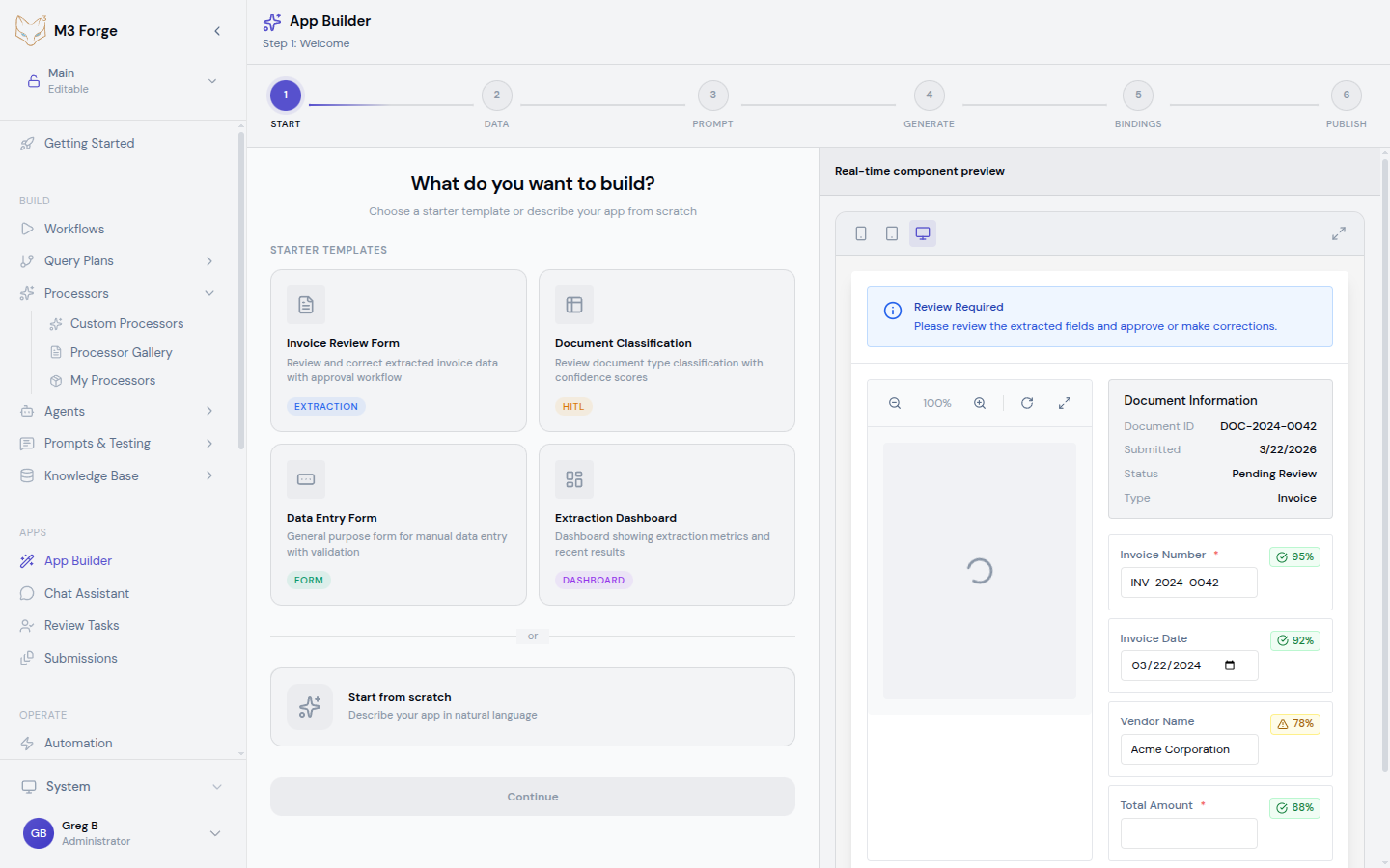
Creating an App
Navigate to App Builder
Click Apps → Builder → New App in main navigation.
Select Template
Choose starting template:
| Template | Description | Use Cases |
|---|---|---|
| Document Portal | Upload and track documents | Invoice submission, form collection |
| Approval Interface | Review and approve items | Expense approvals, contract reviews |
| Data Collection | Guided forms for data entry | Customer onboarding, surveys |
| Knowledge Search | Search knowledge base | Internal wiki, documentation |
| Chat Assistant | Conversational AI interface | Customer support, Q&A |
| Blank | Start from scratch | Fully custom requirements |
Templates provide pre-configured layouts, components, and workflows.
Configure App Settings
Set basic app configuration:
| Setting | Description | Required |
|---|---|---|
| App Name | Display name | Yes |
| URL Slug | Custom URL path (e.g., /apps/invoice-portal) | Yes |
| Description | What the app does | No |
| Icon | App icon (emoji or upload image) | No |
| Category | Internal, External, Partner | Yes |
Customize Appearance
Brand the app:
Theme:
- Primary color
- Secondary color
- Background color
- Font family
Logo:
- Upload company logo
- Set logo size and placement
- Configure for light/dark mode
Layout:
- Header style (fixed, sticky, hidden)
- Sidebar position (left, right, none)
- Footer content
Live preview updates as you customize.
Configure Features
Enable app capabilities:
Document Upload:
- File types allowed
- Max file size
- Single or multiple files
- Drag-and-drop support
Workflows:
- Select workflow to trigger
- Map form fields to workflow inputs
- Configure success/error handling
Knowledge Base:
- Select RAG indices to search
- Configure search UI
- Set result display format
Authentication:
- Public (no login) or authenticated
- Required user roles
- SSO configuration
Set Up Workflows
Connect app to processing workflows:
- Click Add Workflow
- Select workflow from list
- Map app inputs to workflow parameters
- Configure workflow outputs to display
- Set error handling behavior
Multiple workflows supported (different actions trigger different workflows).
Test App
Preview app before publishing:
- Click Preview to open test environment
- Interact with app as end user would
- Test all features and workflows
- Verify appearance on mobile and desktop
- Fix issues and re-test
Publish App
Deploy app to production:
- Review configuration summary
- Click Publish
- App deploys to configured URL
- Share link with users
Published apps are live immediately.
Apps remain in draft mode until published. Draft changes don’t affect live app. Test thoroughly before publishing.
App Components
App Builder provides pre-built components:
Form Components
Text Input:
- Single-line or multi-line
- Placeholder text
- Validation rules (required, pattern, length)
Dropdown:
- Static options or dynamic from API
- Multi-select support
- Searchable for long lists
Date Picker:
- Single date or date range
- Min/max date restrictions
- Default to today or custom
File Upload:
- Single or multiple files
- File type restrictions
- Preview uploaded files
Checkbox/Radio:
- Single or multiple choice
- Custom labels and values
Display Components
Text Block:
- Rich text formatting
- Markdown support
- Variable substitution
Image:
- Upload or URL
- Responsive sizing
- Alt text for accessibility
Table:
- Static data or from workflow
- Sortable columns
- Pagination
Card:
- Container for grouped content
- Header, body, footer sections
- Clickable for navigation
Action Components
Button:
- Submit form
- Trigger workflow
- Navigate to page
Link:
- Internal or external navigation
- Open in new tab option
Layout Components
Container:
- Group components
- Padding and spacing
- Border and background
Column Layout:
- Multi-column responsive layout
- Configurable column widths
Tabs:
- Organize content into tabs
- Switchable panels
Accordion:
- Collapsible sections
- Expand/collapse behavior
Component Configuration
Each component has configuration options:
Common Properties
All components support:
- Label — Display text
- ID — Unique identifier for workflows
- Visibility — Show/hide based on conditions
- Validation — Required, format, custom rules
- Help Text — Tooltip or inline guidance
Conditional Logic
Show/hide components based on conditions:
If [document_type] equals "invoice"
  Show [invoice_fields]
Else
  Hide [invoice_fields]
Supports:
- Field value comparisons
- User role checks
- Workflow output values
Data Binding
Connect components to data sources:
Static Data:
- Hardcoded values
- Pre-defined lists
Dynamic Data:
- Workflow outputs
- API responses
- Knowledge base queries
- User profile data
Configure bindings in component settings.
Sensitive data bindings require authentication. Don’t expose protected data in public apps.
Workflow Integration
Connect app actions to workflows:
Triggering Workflows
Form Submission:
- User completes form
- Click submit button
- App validates inputs
- Workflow starts with form data as inputs
- User sees confirmation or error
Button Click:
- User clicks action button
- Workflow starts with configured inputs
- Progress indicator shown
- Result displayed on completion
File Upload:
- User uploads file
- File processing workflow triggered
- Upload progress shown
- Workflow results displayed
Workflow Inputs
Map app data to workflow parameters:
| App Field | Workflow Parameter | Transform |
|---|---|---|
invoice_file | document | Upload to storage |
supplier_name | vendor | Uppercase |
amount | total | Parse number |
Transformations ensure data compatibility.
Workflow Outputs
Display workflow results in app:
Success Output:
- Show success message
- Display extracted data
- Redirect to next step
- Download generated files
Error Output:
- Show error message
- Highlight invalid fields
- Offer retry option
- Log error for debugging
Configure output handling per workflow.
Page Management
Apps can have multiple pages:
Creating Pages
- Click Add Page in builder
- Name page and set route (e.g.,
/submission-status) - Add components to page
- Configure navigation between pages
Page Types
Landing Page:
- First page users see
- Overview and primary actions
- Can be public or authenticated
Form Page:
- Data collection
- Multi-step wizards
- Validation and submission
Results Page:
- Display workflow outputs
- Show submission status
- Download reports
Error Page:
- Friendly error messages
- Contact support
- Return to home
Navigation
Configure navigation:
Menu Items:
- Add to header or sidebar menu
- Set display name and icon
- Restrict by user role
Buttons:
- Navigate on click
- Pass data between pages
- Open in new tab
Breadcrumbs:
- Show current location
- Navigate back to previous pages
User Management
Control app access:
Authentication
Public Access:
- No login required
- Limited features (usually read-only)
- Rate limiting to prevent abuse
Authenticated Access:
- Login required
- Full features enabled
- User-specific data
SSO Integration:
- SAML, OAuth, OpenID Connect
- Corporate directory integration
- Single sign-on convenience
Authorization
Role-Based:
- Assign users to roles
- Configure features per role
- Hide/show components by role
Permission-Based:
- Fine-grained control
- Permissions per action
- Combine permissions for complex rules
User Profile
Display user information:
- Name and email
- Profile picture
- User preferences
- Activity history
Access via {{user}} variable in components.
User data is automatically available in workflow context. No explicit passing required.
Data Management
Handle app data:
Storage
Session Storage:
- Data persists during session
- Cleared on logout or tab close
- Use for temporary state
Local Storage:
- Data persists across sessions
- Stored in browser
- Use for preferences
Database Storage:
- Persistent backend storage
- Available across devices
- Use for submission data
Data Validation
Client-Side:
- Immediate feedback
- Reduces server load
- JavaScript-based validation
Server-Side:
- Security validation
- Business rule enforcement
- Cannot be bypassed
Both recommended for robust validation.
Data Privacy
Protect user data:
- Encrypt sensitive fields
- Comply with GDPR/CCPA
- Implement data retention policies
- Provide data export/deletion
Styling and Theming
Customize app appearance:
CSS Customization
Pre-Built Themes:
- Light and dark mode
- High contrast for accessibility
- Company brand themes
Custom CSS:
- Override default styles
- Target specific components
- Responsive breakpoints
CSS Variables:
- Define reusable values
- Consistent spacing and colors
- Easy global changes
Responsive Design
Apps automatically adapt to screen size:
- Desktop (>1024px) — Full layout with sidebar
- Tablet (768-1024px) — Compact layout, collapsible sidebar
- Mobile (<768px) — Single column, hamburger menu
Test on all screen sizes before publishing.
Accessibility
Built-in accessibility features:
- ARIA labels for screen readers
- Keyboard navigation
- Color contrast compliance
- Focus indicators
- Skip navigation links
Additional customization available for WCAG compliance.
Deployment
Publish apps to production:
Hosting Options
M3 Forge Hosted:
- Apps run on M3 infrastructure
- Custom subdomain (e.g.,
myapp.m3studio.ai) - SSL certificate included
- Automatic scaling
Self-Hosted:
- Deploy to your infrastructure
- Full control over hosting
- Requires technical setup
Embedded:
- iFrame embed in your website
- Seamless integration
- Requires CORS configuration
Custom Domains
Use your own domain:
- Configure DNS CNAME record
- Add domain in app settings
- SSL certificate auto-provisioned
- Verify ownership
Example: portal.mycompany.com
Version Management
Draft Mode:
- Work on changes without affecting live app
- Test in preview environment
- Publish when ready
Live Version:
- Currently deployed to users
- No downtime during updates
- Instant rollback if issues
Version History:
- Review past versions
- Roll back to previous version
- Compare changes
Monitoring and Analytics
Track app performance:
Usage Metrics
- Page views — How often each page is viewed
- Unique visitors — Number of distinct users
- Session duration — Time spent in app
- Actions — Button clicks, form submissions
Performance Metrics
- Load time — Time to interactive
- API latency — Workflow execution time
- Error rate — Failed requests
- Uptime — Availability percentage
User Feedback
Collect user input:
- Ratings — Star ratings for app
- Comments — Freeform feedback
- Feature requests — What users want
- Bug reports — Issues encountered
Review feedback in app analytics dashboard.
Analytics are anonymized by default. Enable user-level tracking only with consent.
Troubleshooting
Common issues and solutions:
App Won’t Publish
Symptoms: Publish button disabled or error on publish.
Solutions:
- Complete all required configuration fields
- Fix validation errors shown in builder
- Ensure workflow connections are valid
- Check that URL slug is unique
Workflow Not Triggering
Symptoms: Submit button does nothing or workflow doesn’t start.
Solutions:
- Verify workflow is published and active
- Check input mappings are correct
- Review workflow execution logs for errors
- Test workflow independently of app
Layout Issues
Symptoms: Components overlap or don’t display correctly.
Solutions:
- Check responsive settings for all screen sizes
- Verify container nesting is correct
- Clear browser cache and reload
- Test in different browsers
Slow Performance
Symptoms: App loads slowly or feels sluggish.
Solutions:
- Optimize images (compress, resize)
- Reduce number of components on single page
- Enable caching for static content
- Review workflow execution times
Next Steps
- Build conversational interfaces with Chat Assistant
- Advanced customization via Custom Apps
- Integrate external systems using Webhooks
- Connect to Workflows for processing